The Color That Almost Wasn't
Architect Irving Morrow fought the U.S. Navy and Army to paint the bridge International Orange instead of battleship gray or candy-cane stripes.
The color was not chosen for the beauty of the thing itself but because of the beauty of the setting.
— Irving Morrow
The Color That Almost Wasn’t
In 1935, the Golden Gate Bridge’s iconic color was decided, a moment that shaped its identity and legacy.
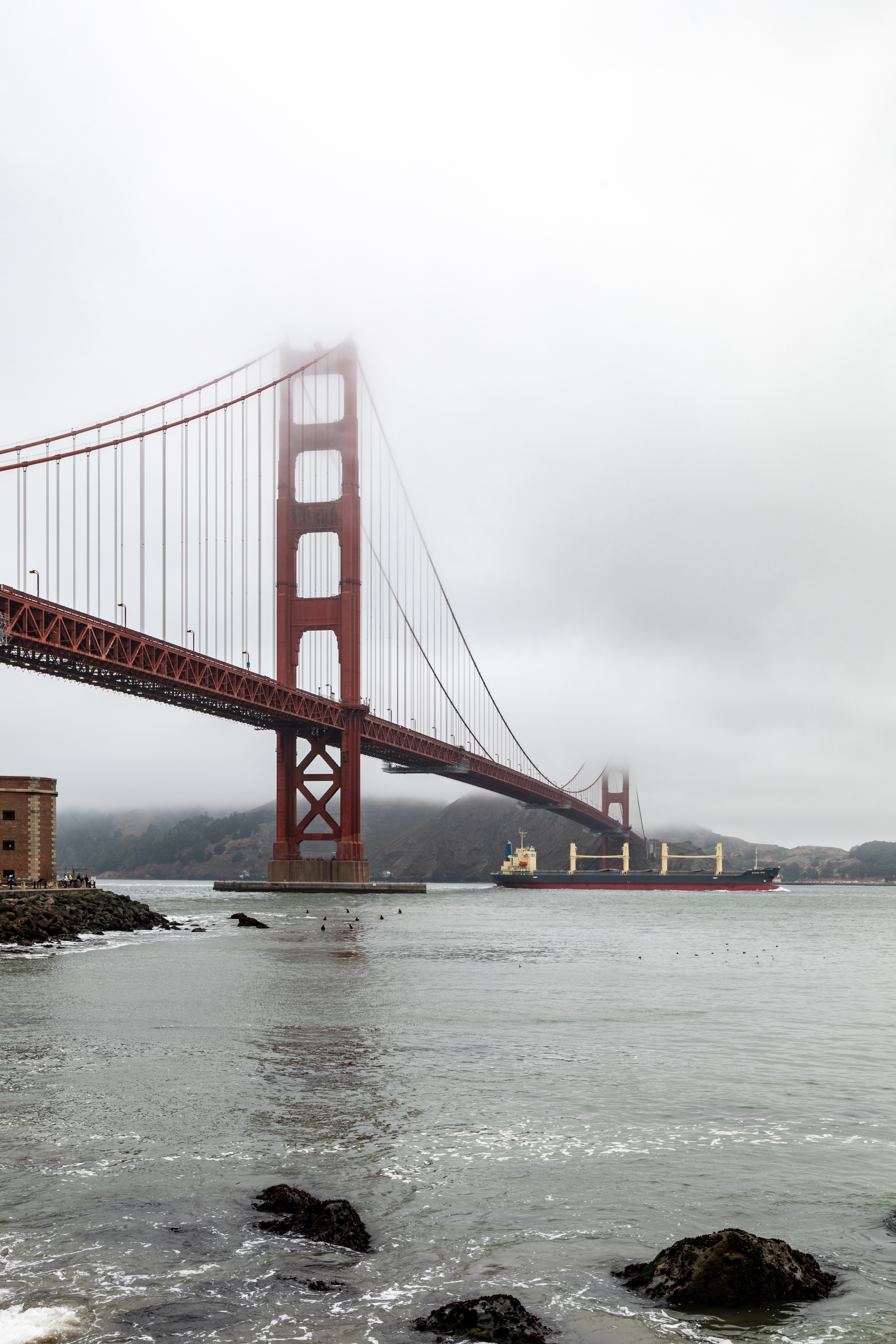
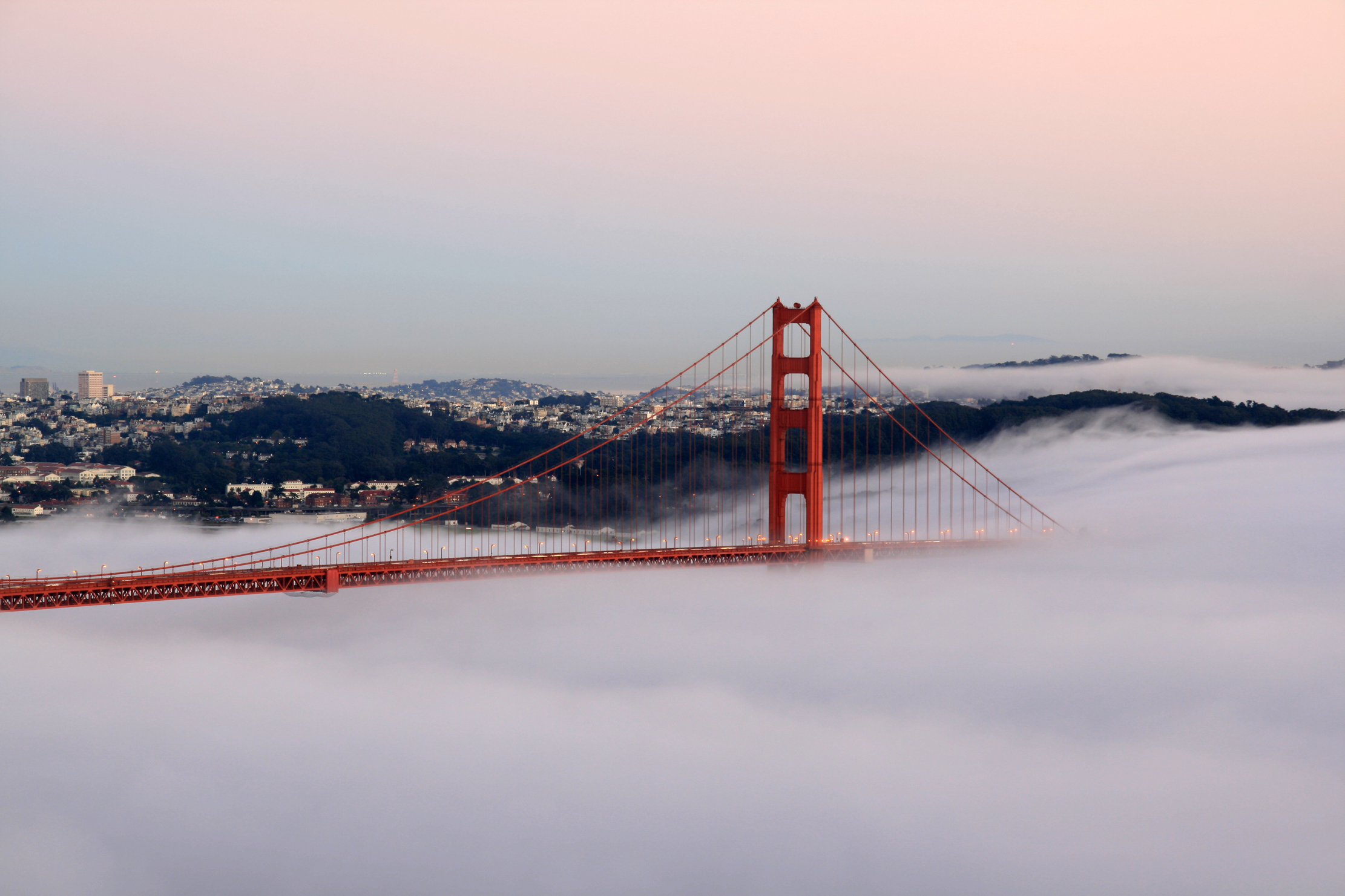
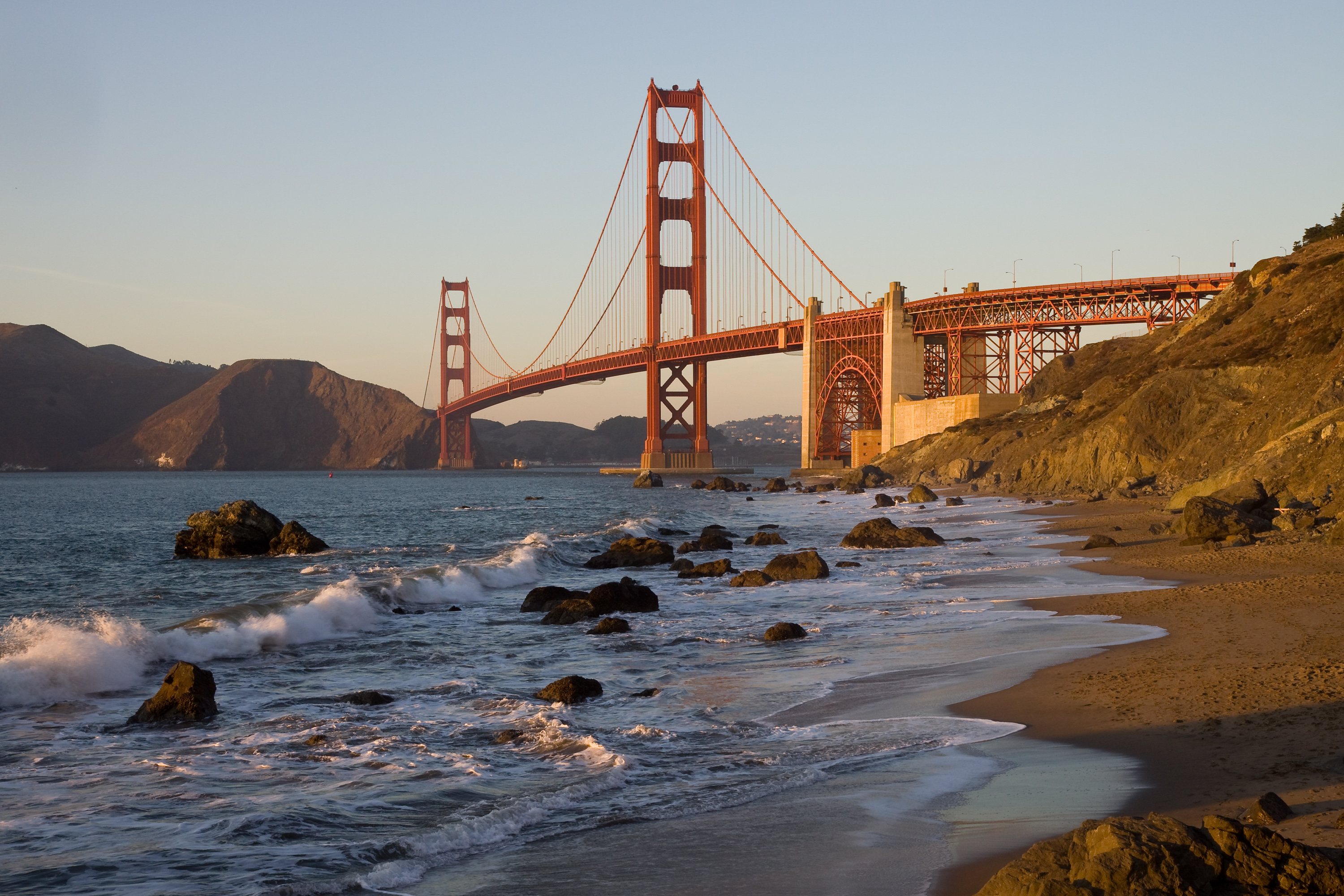
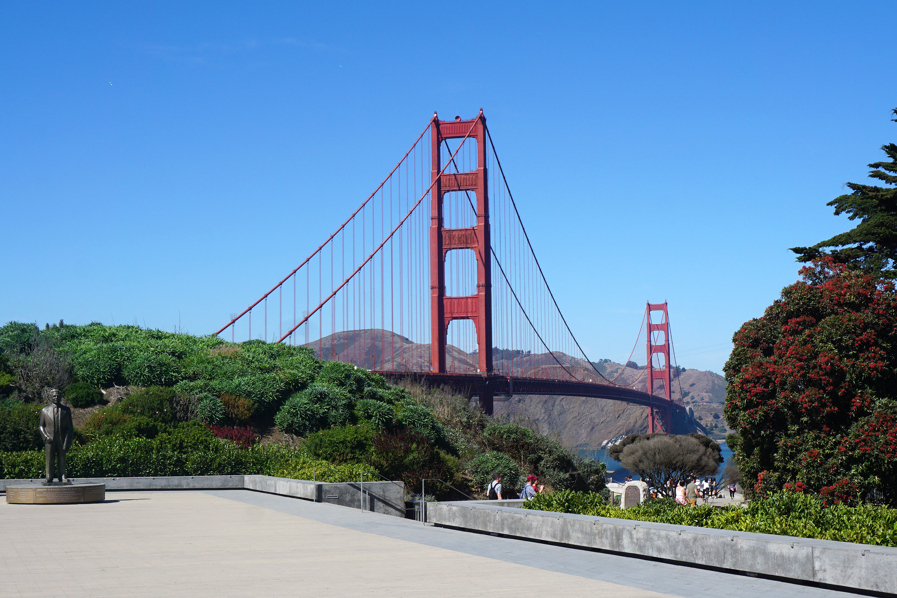
What happened: In 1935, the Golden Gate Bridge’s color was debated among various stakeholders. The U.S. Navy proposed black with yellow stripes for visibility, while the Army Air Corps suggested red-and-white stripes. Consulting architect Irving Morrow, however, advocated for the red-orange primer already on the steel, arguing it harmonized beautifully with the surrounding landscape and fog. His vision prevailed, and the board adopted International Orange as the permanent color. 1
Why it matters: This decision not only enhanced the bridge’s aesthetic appeal but also made it a globally recognized symbol of San Francisco and California. The color International Orange has since become synonymous with the Golden Gate Bridge, reflecting its significance in architectural and cultural history. 2
Further reading:
Why This Mattered
The U.S. Navy wanted the bridge painted black with yellow stripes for ship visibility, while the Army Air Corps proposed red-and-white candy-cane stripes. Consulting architect Irving Morrow argued that the red-orange primer already on the steel harmonized with the landscape and fog, and persuaded the board to adopt International Orange permanently. The color became inseparable from the bridge's identity and one of the most recognized architectural color choices in the world.